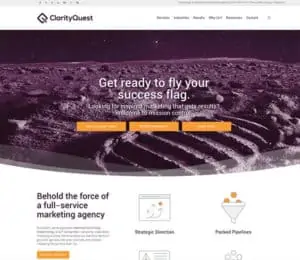
If you are a frequent visitor, you’ll notice lots of changes on the Clarity Quest site. If you’re new, welcome! We’ve spent the past year updating the brand positioning and design of our agency and are excited to share our new work and the thought process behind the overhaul.
Why change now?
While I agree with Seth Godin 99% of the time, I don’t agree that you should keep a logo/brand identity for as long as you keep your first name. Imagine if you had that same haircut from the 80s. Styles and companies grow and evolve, and positioning and the visual brand should reflect this. After 18 years in business, it was time for us to have a new style and swagger.
We started in 2001 as a marketing agency that worked everyone: tech, lawyers, display companies, and B2C companies. While we were never a generalist agency, we did have our hands in many jars.
Five years ago, we decided to focus on three core industries: healthcare tech, biotech, and information tech. Our agency flourished. Our branding needed to better reflect these changes.
What’s up with the new logo?
 A stylized “Q” symbolizes a magnifying glass focusing in on a “C” created from the negative space. This shows our quest to help clients find clarity in their marketing message so they can create their own success stories.
We selected a modern sans-serif font displayed at a larger size (relative to the icon) in title case format for optimal legibility even when the logo is shown at smaller sizes.
So purple reigns?
We retained our Clarity Quest purple color theme, albeit with a more sophisticated shade, to help ease the brand transition for our existing customers and leads, while adding in some bolder secondary colors (for website call-to-action areas and buttons) to demonstrate our focus on technology-forward B2B companies.
Plus, purple is my favorite color, and I just couldn’t abandon it! After all, I’ve read violet gemstones increase imagination, remove perceived obstacles, calm confrontations, and re-energize the learning of new things. I can think of no better color to convey our culture.
 What’s up with the space visuals on the website?
On our homepage and in our collateral, you’ll see images of the moon print and flag planting. Our new brand messaging promotes telling your epic success story. And what’s more heroic than the moon landing?
The accomplishment we are most proud of at the agency is helping dozens of owners and marketing leaders reach their goals, whether that was acquisition, equity investment, revenue growth, or a big promotion.
Can’t find something?
If you can’t find an asset or page you loved on our old site, contact us. We’ll respond promptly with the information you need.
Thinking of a brand update?
Feel free to reach out, and we’ll objectively discuss if it’s the right time for our organization.

 What’s up with the space visuals on the website?
