Your logo is an essential part of your company’s brand identity. With one look, a logo can create a lasting impression on your customers or have no impact at all. Ideally, your logo is shorthand for what your brand represents.
This unique ability is what makes logo design – a seemingly small piece of creative work – so immensely important.
Four characteristics of a well-designed company logo
Logo design has many variabilities based on your company’s history, industry, and intended target audience.
Clarity Quest’s Senior Creative Director, Casey Frushour, offers these four enduring characteristics of a well-designed company logo:
- Simple: A simple logo design is quickly and easily recognizable. Since logos frequently appear in smaller sizes on social media and in one color depending on the background, simple design offers the versatility and adaptability needed to ensure your logo remains recognizable in its various forms.
- Unique and memorable: A powerful logo typically features a distinctive element worked into the design that is specific to what your business does, increasing your logo’s memorability for your customers.
- Timeless: Great logos withstand the test of time and endure throughout the years. Avoid trends or design fads in colors, themes, and font treatments.
- Appropriate: Color schemes, font choices, and design style should match your business objectives and be brand-appropriate. Think your logo’s font doesn’t matter? Here’s how to select the perfect font (spoiler alert: comic sans isn’t it).
I encourage you to use these tips when embarking on a logo design or redesign. Figure out how you want your company to be perceived and design a logo emblematic of your brand.
Logo design in the real world
When considering how your logo will be perceived in the real world, don’t be afraid to look at what your competitors are doing—it’s essential to stand out, especially in the crowded health tech and biotech industries.
You also shouldn’t be afraid to change your logo either. Brands endure because they meet the ongoing needs of their existing customers. Nowhere is this so true as in the technology industry. Check out the evolution of the logos for eight iconic tech brands.
In the end, make sure your logo speaks to your target audience and is consistent with your brand objectives.
Still not sure how these characteristics translate to the real world?
Here are two examples of logos and the stories behind them:
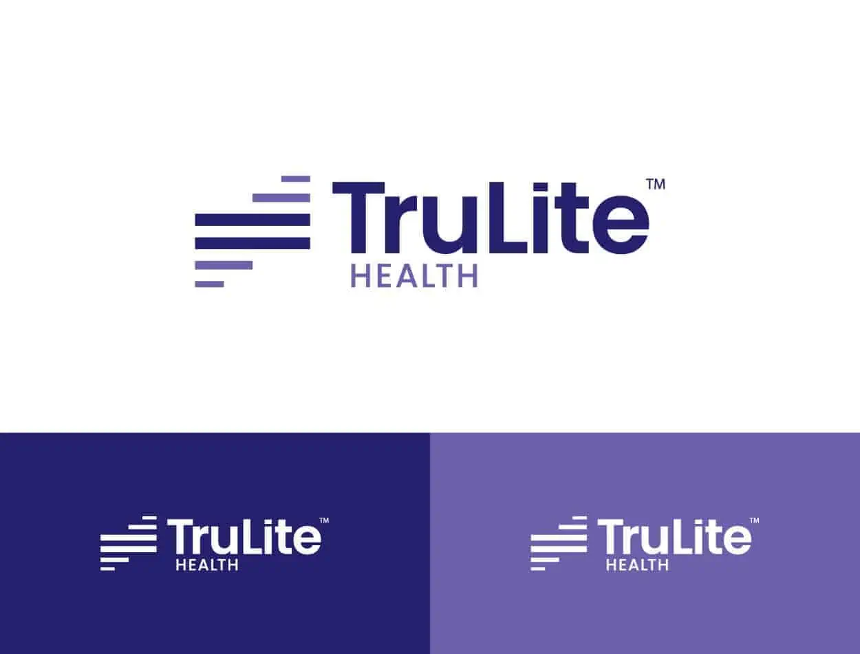
TruLite Health is tackling the big, audacious goal of eliminating health inequities with the industry’s first health equity platform built to address racial and ethnic health disparities at the point of care.
We refreshed their original logo to align more closely with their new brand identity. The updated logo features a dark purple equal symbol with shorter lines above and below it to signify their commitment to improving health equity. Learn more about how we helped establish their brand and messaging foundation in a new product category.
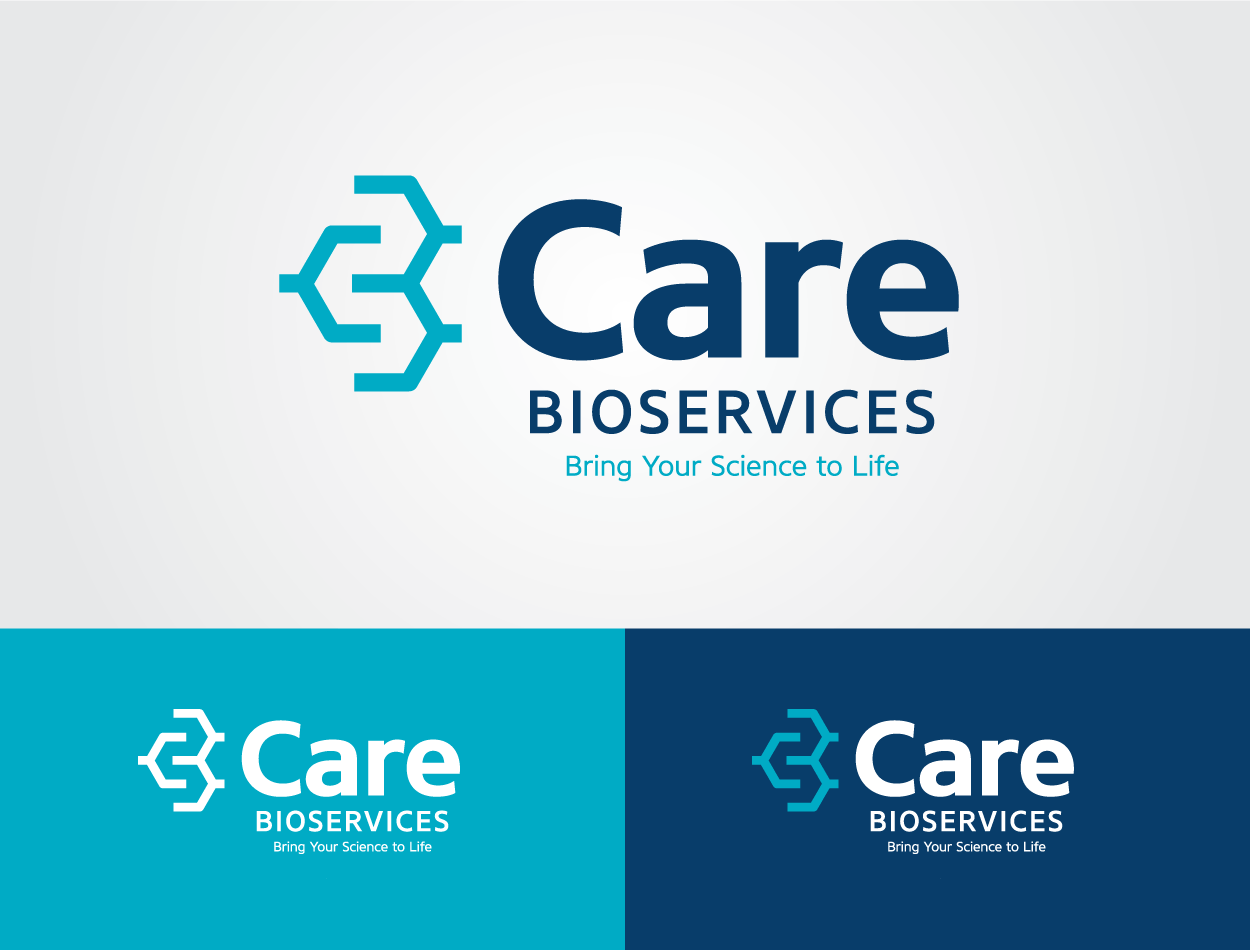
Care Bioservices is a state-of-the-art biopharma contract development and manufacturing organization that approached us to develop its go-to-market brand messaging, logo, and website.
We designed a logo that plays off the recognizable shorthand formula for an organic compound that uses connected hexagons to create the letters “C” and “B”—making the logo uniquely theirs. Read more about how we helped bring their new brand to life.
Ready for a new logo design?
Your company’s logo is one of the many ways attention-grabbing visuals and graphic design elements can help tell your brand’s story.
When you’re ready to design your new company logo or refresh your brand, partner with a healthcare marketing agency that specializes in growing brands like yours.
Note: This post was originally published in 2020 and has been updated to reflect current trends.


