Americans are using smartphones everywhere they go. They use them at home, in the car, at work, at the gym, in the doctor’s office waiting room, at the store, and even in bed. When was the last time your cell phone was out of your site for more than 30 minutes? I bet you have a hard time answering that question.
We use smartphones from all sorts of locations to access social media, email, watch videos, take pictures, play games, and use search engines. Most important to business owners and marketers, smartphone owners are using their mobile devices as consumers. People are surfing the web on their phones, clicking on ads, and browsing Google search results looking for products and services they need.
Of the 61% of Americans who own smartphones, over 46% have made purchases from their mobile phone. Is your business capitalizing on the growing number of mobile consumers?
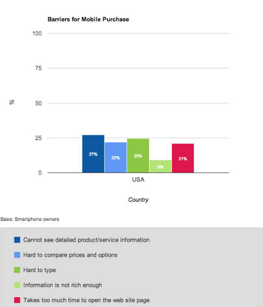
Below is a graph of the most common barriers to mobile purchase – reasons why mobile consumers are turned off from making a purchase on their phone.
Is your mobile website turning off consumers and costing your business revenue? Here are our healthcare marketing agency’s tips for avoiding these common mobile website pitfalls:
1. Visitors cannot see detailed product/service information.
Since this is the #1 barrier to purchase on smartphones, seriously consider reevaluating the layout of your mobile site. Stick to high-quality images and only include the most important information that will help convert visitors to consumers.
2. It’s hard to type.
Typing on smartphones is difficult and time consuming for many people. Help your visitors out by eliminating lengthy forms. Only ask for the most important information, and provide a list of options to choose from wherever possible.
3. It’s hard to compare prices and options.
Get inside the minds of your consumers. Pair similar products on the same page so they can evaluate their options side by side. Help your consumers by eliminating as much navigation as possible.
4. It takes too much time to open the webpage.
Slow loading websites are detrimental regardless of the device. Consumers aren’t patient enough and will continue their search if your page doesn’t load quickly or properly. Slow load times can also hamper your search engine optimization efforts.
5. The information is not rich enough.
This one is tricky. While it’s important to make your mobile content short and sweet, it must still tell the right story or paint the right picture. It has to be short enough to maintain interest, but detailed enough to close the deal. This is a balance that may be difficult to achieve, but will pay off.
By following these simple user experience and web design guidelines, you can create a great mobile experience that will turn visitors into conversions.
Sign up for our free monthly e-newsletter to get tips and insights directly in your inbox.
Need help designing your website? Our expert graphic designers can help with your next web design, mobile website, or mobile app project. View Clarity Quest Marketing’s portfolio online, or call (877) 887-7611 to learn more.
Author: +Brian Shilling


