Creating a new logo can be an exciting or frustrating process, depending on how the creative agency and client approach the project.
Sometimes there’s a disconnect…
Going into a logo presentation meeting, an agency has already done a ton of work. They have compiled research, created sketches, scrapped ideas, iterated concepts, and then only a select few even made it to a computer screen for further exploration. In most cases, CLIENTS DO NOT KNOW THIS.
The client sometimes thinks creatives simply go to their computers after the kick-off meeting and work up the first three ideas that come into their heads. That’s why we’ve designed a reveal process for our clients.
What’s a design reveal process?
A well-designed reveal process gives clients insight into the deep dive an agency took into their company and its business objectives. It shows the creative director knows who the client’s audience is, and how to best communicate the client’s brand to those potential customers. Most importantly, it positively changes the way clients view design concepts.
It’s always best to present logo designs in person, but if budget or geography makes that difficult, a screen share meeting works just fine. We NEVER simply email the designs to the client and ask for their feedback. This results in great designs hitting the cutting room floor and other concepts getting picked apart until they are just a shell of their previous glory.
Here are a few tips on how we present logo concepts in a way that results in happier clients and faster approvals.
1) Review business objectives
Immediately before presenting the logo designs, we recap all business objectives discussed in previous meetings. Who was the target demographic? What kind of feel did the client want the logo to give off? What design styles did the client admire?
Revisiting all of these points shows we considered all the information, reviewed meeting notes, and ensured all parties were on the same page before the reveal.
Pro Tip: One of the last slides we present before the concepts are shown is a brief list of keywords describing what the logo designs should represent. This puts the clients in the right mindset to understand and welcome our designs.
2) Reveal and explain
We typically have three or four design concepts to present to the client. We show each one individually, taking the time to explain our thought process behind each design.
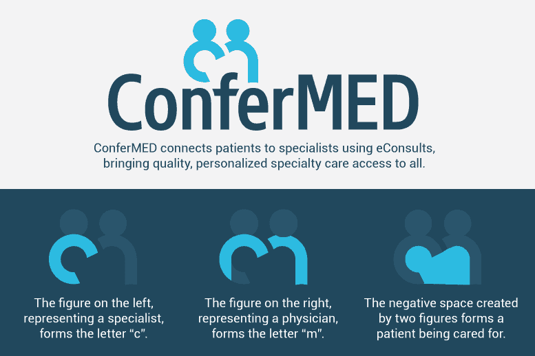
We don’t assume the client will instantly know what our design means or what visual may be hidden within the design. We go over why we chose the thickness of the strokes and selected the font. By presenting all of this information, the concept holds more value and makes more sense to the client.
In the ConferMED example, notice how the logo becomes more purposeful and powerful once you understand more of the meaning behind the design decisions.
Pro Tip: We show the strongest/favorite design either first or last. In our experience, these are the two positions that get remembered or discussed the most.

3) Show the logo designs in various sizes and in the real world
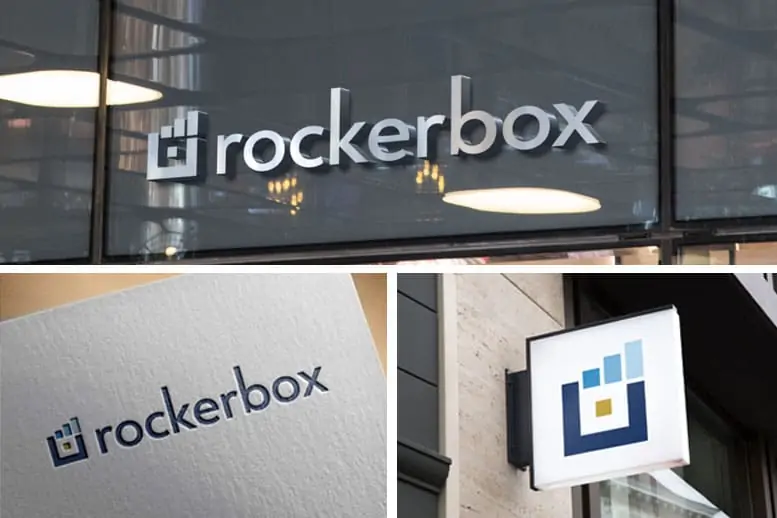
For the reveal, we present each concept in various sizes (color and black/white) and on different background colors to show the versatility of each design.
More recently, we started showing the logo being used in the “real world,” such as on mocked up letterhead or signage. The fashion industry has been doing this forever. Designers don’t just show pictures of their clothes laid out flat on a table. They put them on models so everyone can see how the fabric flows and functions.
We mock-up the concepts in various scenarios, so the client will very clearly see how the designs will look in use. This not only helps to sell the design as a full campaign but also shows that we are a creative strategic partner rather than just a “design shop.”
Pro Tip: If possible, we get a client-specific office picture (their actual building exterior or waiting room) and mock-up the logo using these images. This surprises and excites the client, making the design even easier to “sell.”

4) Get Constructive Feedback
Once we present each concept, we open up the floor for comments on any of the designs. We encourage the client to frame their feedback around how the designs do or don’t measure up to the business objects set in step one.
Ideally, one logo will prevail as the top choice allowing us to focus on only one concept for design iterations moving forward, but this is often not the case. We compile everyone’s input into a comprehensive list agreed on by all parties. It’s important to get the group’s sign off on the feedback at this stage as it helps to reduce the rounds of changes we have to make to future designs, thus speeding up the process.
Pro Tip: Leave your ego at the door. We carefully consider all the feedback we receive. Even though our client most likely is not a designer, they often say something that improves our current concepts or sparks an idea for a new design.
These four simple steps dramatically improve how clients perceive and respond to initial logo design concepts. In the end, this method helps both our clients and our agency, as it allows for a smoother creative process and clears the path for the best logo design to emerge.
