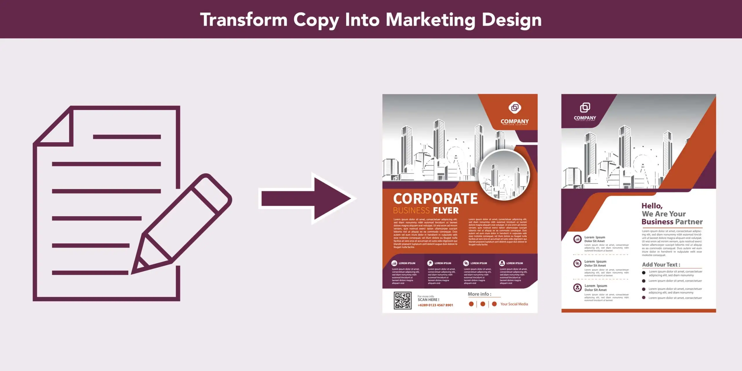
One of the more challenging aspects of being a marketing leader is giving design feedback.
I’m sure you’ve been there—you have an amazing idea in your head that you share with your creative team, and approve what you believe to be the best copy to bring that idea to life.
Yet, you are disappointed when you see it for the first time. It looks nothing like what you envisioned. You’re frustrated and realize you can’t articulate why.
The good news is that the right healthcare tech marketing agency can help you navigate this conversation. Here are some tips and tricks I’ve learned about giving graphic design feedback that leads to better creative deliverables.
Seeing your copy through a design lens
First, let’s start with the copy. One way to ensure a creative deliverable aligns with your expectations is to review and edit the copy with design top-of-mind.
Here are a few items to consider:
- Prioritize the user experience
- Add design notes as you draft and edit the copy
- Visualize how the layout can complement—not compete with—the narrative
- Look at past examples to see what did or did not work in a layout
Whether you are the copywriter or the marketer tasked with reviewing and approving the copy, it is essential to think about the copy within context. Which is all fine and good, but now what?
Crafting a stellar creative brief
Enter the creative brief.
A detailed creative brief is the best way to communicate what’s in your head to the designer who will bring your vision to life—that person is not a mind reader.
Here are five things a marketer should put in every creative brief:
1. Takeaways
In one sentence, describe what you want the target audience to take away from the piece. This helps the designer understand what’s most important.
If you can’t articulate what a person will walk away with, you should rethink the reason you’re creating it in the first place.
2. Call-to-action
What do you want the target audience to do after interacting with the marketing collateral or digital asset?
It’s the marketer’s job to think through the customer and prospect journey, where do they go and how will you track that activity?
3. Imagery details and specifics
A designer only knows if you want to use a photo or an illustration if you tell them. The bottom line is that the more specific you are in the creative brief, the better that first draft will be.
For example, directing the designer to use healthcare imagery is too broad. It’s better to provide a more detailed description, such as use a photo of an older patient in a hospital bed talking to a doctor who is holding a tablet. Not sure what type of imagery would be best? Go to your favorite stock photo site and include a few links.
4. Organizational hierarchy in the copy
The designer needs to know what copy is the most important to draw the reader’s attention to and in what order. You will also want to indicate what copy sections go together. As an example, if you are designing a double-sided sales sheet, you will want to mark an appropriate page break in the copy.
It is also helpful to recommend what copy to highlight in a call-out or other design element. Your designer will not be as familiar with the copy as you are, and providing this will point them in the right direction for a better quality deliverable.
5. Examples or sketches
It may be easier to show your designer what you envision rather than explain it with words. Share links to websites or PDFs with designs that you like, you may even use them to show what you don’t want something to look like.
Can’t find something that looks like what you want? Sketch out what’s in your head, or use a PowerPoint slide to explain where copy blocks should go.
Remember, the more direction you give, the better the outcome.
First draft blues
So, you’ve done the work. You spent time visualizing the copy and crafted a robust creative brief.
With bated breath, you open the first draft, and you are confronted with any number of disappointments:
- The dreaded wall of text
- An icon where you wanted a photo
- A line break that disrupts the meaning
Your designer is not going to be insulted if you communicate changes to them. In fact, they want the piece to be better as well.
Here are some of my go-to questions to ask when evaluating the first draft of a designed marketing piece:
- Does the designed piece clearly communicate what you intended it to?
- If you were encountering the designed piece for the first time, does it make sense? Put yourself in the target audience’s shoes.
- Could an additional subhead improve readability? Spoiler alert: the answer is probably yes!
- Is there enough white space or is your copy crammed into a too small space?
- Are there line breaks that disrupt the reading flow or meaning?
Better design feedback = less frustration
Bringing marketing collateral and digital assets to life is ultimately a work of collaboration between marketers, copywriters, designers, and many others.
Having the skills to communicate what you want the piece to become will ensure a higher quality deliverable with less time and frustration going back and forth. There is no doubt that taking the time to do this upfront is worth it in the long run.


