According to 2024 research, 90% of B2B buyers research 2–7 websites before making a purchasing decision. This means that an overwhelming amount of people will research a product they are in the market for before making a final decision—giving your website time to shine and impress potential customers.
Even when people aren’t shopping online they are still using the Internet as a source for preliminary decision-making information such as product attributes, price comparisons, and reviews, especially for significant purchases.
To capitalize on this consumer trend, your website must not only attract attention but drive customers to purchase.
Here are 14 best practices our B2B healthcare marketing agency rigorously follows when we develop client websites.
1. Audience awareness
If you have two distinct audiences that require different messaging, try to get them to self-identify and navigate to the proper area of your site as quickly as possible. Therefore you can serve them relevant content, calls to action, and a more personal experience.
2. Sound SEO
Potential customers must be able to find your company easily. To establish a web presence and gain a place at the top of search engine results pages, you must have an effective search engine optimization strategy.
Whether this is done organically by strategically placing keywords and links throughout your website, or with paid search, your page will rank highly on Google and other popular search engines and will increase your visibility among consumers.
Finding the balance of creative with SEO is key. Organic search can be a huge driver of traffic and leads to your site, so don’t sacrifice sound search engine optimization practices for shiny new design trends or infinite scroll pages. Remember that quality content is the thing that both website visitors and search engines crave.
3. Usability
Your site must be easy to navigate and coherently structured. Google generates millions of results for every search word or phrase, so if a customer can’t find exactly what they are looking for on your page, they will not hesitate to move on to the next link on your competitor’s site.
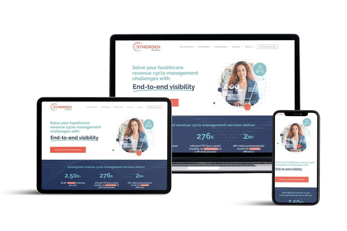
Engaging the customer with interactive marketing is one tactic to keep them from straying to another web page. This means you must also be designed and optimized for all screen sizes (responsive design and fast load times are crucial for keeping users on the site and SEO).
4. Clear directions
A well-designed web page will provide a call to action enticing the customer to move forward with the purchasing process. Once a potential consumer has browsed your site and found what he is looking for, he must be able to recognize his options and know how to continue his search or where he can purchase your product or service.
5. Sensible structure and navigation
It should be clear to the visitor where they are on your site and they should have an obvious and direct path to further explore the site. Lead visitors through the site by pointing them to different pieces of content, resources, or product pages. Important pages and contact opportunities should always be 1-2 clicks away.
People also usually scan through content to determine whether it is useful to them. It’s crucial to use headings, subheadings, paragraphs, bullets, and lists to break it up and make it easy to scan.
6. Fresh content
Constantly add new content. If you have a blog, post at least 2–4 times per month. If you syndicate content, then post daily. It’s a red flag if your last blog post or news update was 2 years ago!
7. Consistent brand messaging
Learn to master message clarity. No matter which page a visitor lands on, it should be crystal clear what your organization does, your value propositions, and what problems you solve.
See below how succinctly SYNERGEN Health’s homepage captures the brand’s essence and speaks to customer pain points while invoking key performance statistics—all “above the fold.” Our work on this client’s website earned a 2024 Website of the Year Award from Swaay.Health.
8. Targeted focus
Don’t try to be all things to all people. If you have disparate audiences, such as physicians and patients, consider a separate microsite for patients. If you try to cram too many messages into one site, your visitors will be confused.
9. Demonstrated expertise
Emphasize compelling content that shows you’re an expert in your field. This content should clearly display your understanding of the users’ problems and show that you can help solve them.
10. Mobile-friendly/responsive design
Nearly two-thirds of global website traffic comes from mobile devices, so building websites for desktop viewing only should be but a distant memory. Be sure to use a responsive framework, ensure readable text, and optimize images, media, and navigation for all devices.
11. Fast-loading site that pays attention to Core Web Vitals
The ideal webpage loading speed is 0–2 seconds. Higher load times correlate directly with higher bounce rates. Speed is one of three Core Web Vitals (CWVs)—the other two are interactivity and visual stability. Google assesses these metrics in ranking sites.
12. Engaging movement and animation (when appropriate)
A strong caveat must be issued here. While website animation can be an effective tactic for drawing in and engaging visitors, it’s easy to go overboard. In general, steer clear of infinite loops and exercise moderation.
13. Inclusive and accessible design
Your B2B website should comply with the Americans with Disabilities Act (ADA) and Web Content Accessibility Guidelines (WCAG) before it goes live. According to the WHO, about 16% of the world’s population experiences a significant disability. Don’t overlook them.
14. Data privacy and user control
If you do any EU business or there is a chance you will in the future (spoiler: there probably is), then you must comply with General Data Protection Regulation (GDPR) standards. That means obtaining explicit consent before placing cookies on your website visitors’ devices and explaining exactly what those cookies do.
Note: this blog was originally posted January 4, 2021, and has been updated to reflect current information.


