Everyone wants to avoid “death by PowerPoint”—whether on the giving or receiving end of a presentation. Here are four PowerPoint design tips you can use today that will add a bit of spark to your design for a very small time investment. Whether you’re creating a new presentation and want to keep your audience engaged, or just need to add a bit of “pizzaz” to an existing presentation, these tips will do the trick.
1. Insert Hyperlinks and Action Buttons
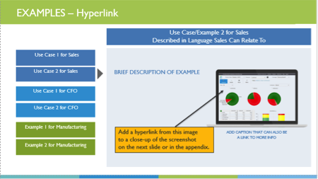
Create a non-linear story using hyperlinks and action buttons. Unlike animations, links are super quick to add and work like pointers from an object on a slide to another location in your presentation. Hyperlinks and action buttons can be attached to objects (blocks, shapes, graphics, words) and can be set to jump forward or backward to any point in your presentation.
The first slide below has a hyperlink added, connecting it to another slide in the presentation, which shows a larger image.

2. Frame Screenshots
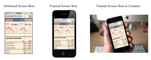
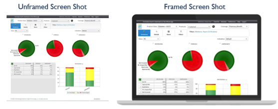
Screenshots are often used in presentations to illustrate what the audience can expect to see on their computer screen, mobile device, tablet or laptop. Rather than adding the “raw” or “naked” screenshot to your presentation, give your shot some context by framing the visual on the device the audience will be using. If you’re presenting a new app and you want to show a series of screen captures, frame each image with a generic phone edge or with the frame that makes the most sense in context.
Mobile Device Framing
Laptop Framing
3. Timing or Location Cues
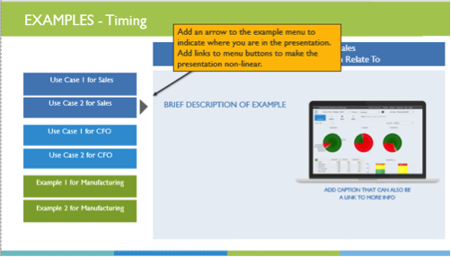
Presenters often lose their audience when there’s no end in sight. Visual cues help your audience digest material in a more logical way and act as a guide for your story. Visual cues could be color-based, shape-based, or graphical.
Timing Cue Example
Use a clock to indicate how much more time the audience has until a section is complete or a concept has been described.
Location Cues
Use a graphic with multiple components that create a final assembled graphic. Puzzle pieces are a common location cue that let your audience know quickly where they are in the story line, how much more information they’ll receive, and how each section of your presentation fits together.
4. Less is More

I challenge you to take an existing presentation and replace 50% of the words on each slide with some visual elements. Set a stretch goal to replace 90% of the words on several slides or use only a graphic. Your audience will appreciate the change of pace and they’ll turn their attention to you and your message.
#PowerPoint Challenge: Replace 50% of the words on each slide. Share on XWhether you are creating a new presentation or updating an existing one, use these four tips to create non-linear, story-telling, and visually appealing presentations that will engage your audience. Provide subtle clues about timing and location, avoid turning presentations into Word documents and use graphics to frame screenshots or add life to your story. No matter your industry, these tips will bring life to your presentation—and most take only minutes to add. Your audience will appreciate it.
Want more expert marketing insights delivered to your inbox? Sign up to receive our monthly newsletter.
