B2B marketers know their audience is on LinkedIn. However, even with the best audience targeting, your LinkedIn Ad campaigns can still fail to meet goals and expectations because the ads simply don’t convert.
Many companies, including your competitors, are vying for the same audience’s attention. Bold creative and compelling copy is vital to breaking through the noise.
Here’s our health tech marketing agency’s framework for success when designing LinkedIn Ads that convert.
For this blog post, a conversion is defined as an individual who submits a form with their contact information.
Value-driven content
Before you start thinking about design, think about the offer.
For B2B companies looking to capture top-of-funnel leads, educational and actionable content that tells the audience how to solve a pain point or overcome a challenge is a great way to generate leads.
Ask yourself: is this offer worth sharing an email address for?
One way to answer this question is to dive into your analytics. We recommend using content that’s resonating on other channels. For example, online assets with an above-average time on page or those that generated the most clicks in your email campaigns may be good candidates to use in your ad campaigns.
Here are three examples of valuable content that has converted for our clients:
- Ten ways to reduce denied claims
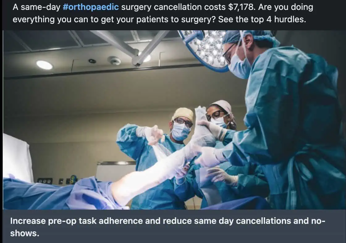
- How to reduce no-shows and same-day cancellations for surgical procedures
- Survey results about real-world data (RWD) trends in the pharmaceutical industry
Find out more about full-funnel marketing content that drives LinkedIn conversions.
Bold imagery
To convert someone on LinkedIn, you first have to get them to see your ad. One of the easiest ways to stop the scroll is with a bold, eye-catching creative.
And by bold, we’re talking bright colors, surprising stock photos or illustrations, animated gifs—anything and everything that ensures your ad stands out, not blends in, with your target audience’s feed.
Before you say your target audience is buying an expensive enterprise-level solution and won’t fall for these marketing tactics, we A/B tested it for you.
Here are the A/B test results for a revenue cycle management (RCM) company targeting professionals in a variety of care settings, including ambulatory surgery centers (ASCs), labs, hospitals, and health systems.
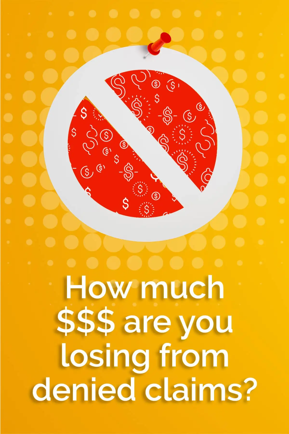
During a one-month test with the same audience, 77% of conversions came from the yellow creative on the right:
You may also consider running animated GIFs to further stand out in your target audience’s feed. Here are some examples:
Mobile first
Because 40% of LinkedIn traffic is on a mobile device, your ads must be optimized for mobile viewing.
Diving deeper into our client data, here’s the percentage of total leads coming from mobile-optimized creative across a variety of clients:
- 78% for one enterprise digital health solution
- 69% for one RCM company
- 63% for one virtual triage solution
Here’s how to optimize your ads to maximize performance for mobile users:
- Keep headline copy at 92 characters or less. Shorter copy ensures a mobile user can read the ad copy without having to click see more.
- Design mobile-friendly vertical creative at 628 x 1200. This layout will be user-friendly for your target audience and signal to LinkedIn when to serve it to a person on mobile.
- A/B test mobile vs. desktop. We recommend every campaign start with both vertical (mobile) and horizontal (desktop) creative to test which format has the highest conversion rate. Reallocate your budget accordingly based on the A/B test.
FOMO
Leaning into your target audience’s fear of missing out (FOMO) is another way to grab their attention.
In a B2B context, FOMO can take a few forms:
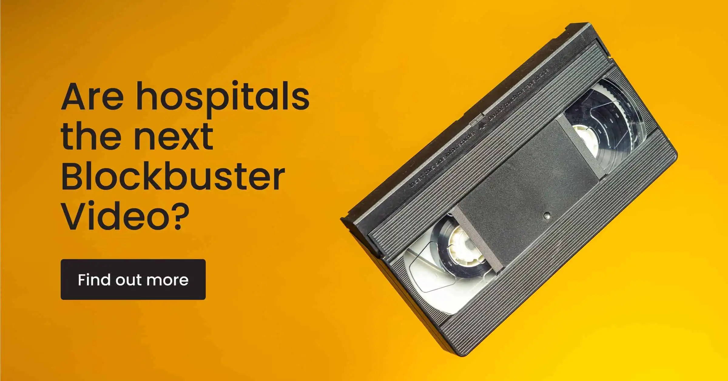
- Dystopian future. Appeal to your target audience’s fear of failure or an aspirational future in which they are no longer relevant.
- Industry benchmarks. B2B audiences love a good stat and pointing out how your company helps organizations beat industry benchmarks gets your potential customers thinking how you could do the same—nobody wants to be below average.
- Case studies. A case study featuring an organization a future customer might recognize is a great way to pique their interest and gives your company credibility.
Sample of dystopian future FOMO:
Read more about this successful LinkedIn Ad campaign targeting the C-suite at large health systems.
Here’s an example of a surprising stock photo coupled with an industry benchmark generating FOMO:
This ad alone generated nearly 48% of their total leads. Read more about this successful lead generation campaign.
LinkedIn Ad lead generation form
When a marketer hears lead generation campaign, you may automatically assume landing page design is also part of the user experience.
However, for LinkedIn Ads, our team recommends using the native LinkedIn Ad lead generation forms (LGFs) to maximize conversions.
We tested the use of LinkedIn Ad LGFs versus a traditional landing page with an embedded form, and the results were clear: Our client saw a 1,250% increase in leads over the course of the campaign.
That being said, the copy for your LGFs is also important and shouldn’t be an afterthought. There is still a chance your target audience will walk away and not complete the conversion, rendering all that creativity for naught.
Here are some tips for form copy that converts:
- Tell the user what to do and what they will receive in exchange for completing the form.
- Make sure the description in the form aligns with the ad copy and imagery they just clicked on.
- Reiterate the benefit of downloading the content.
Design with lead generation in mind
Strategic graphic design is essential to successful LinkedIn Ad campaigns.
👉 Here’s one more LinkedIn creative hot tip before you go: don’t forget about dark mode! Black creative with a pop of color might look great on a white background, but with nearly 82% of smartphone users opting for dark mode, it’s best to A/B test dark vs. light creative.
In the highly competitive health technology and life sciences industries, finding creative ways to stop the scroll and engage is how B2B marketers like you can convert more impressions into leads.

